
Product Design · UX/UI · Branding
Cotrotter
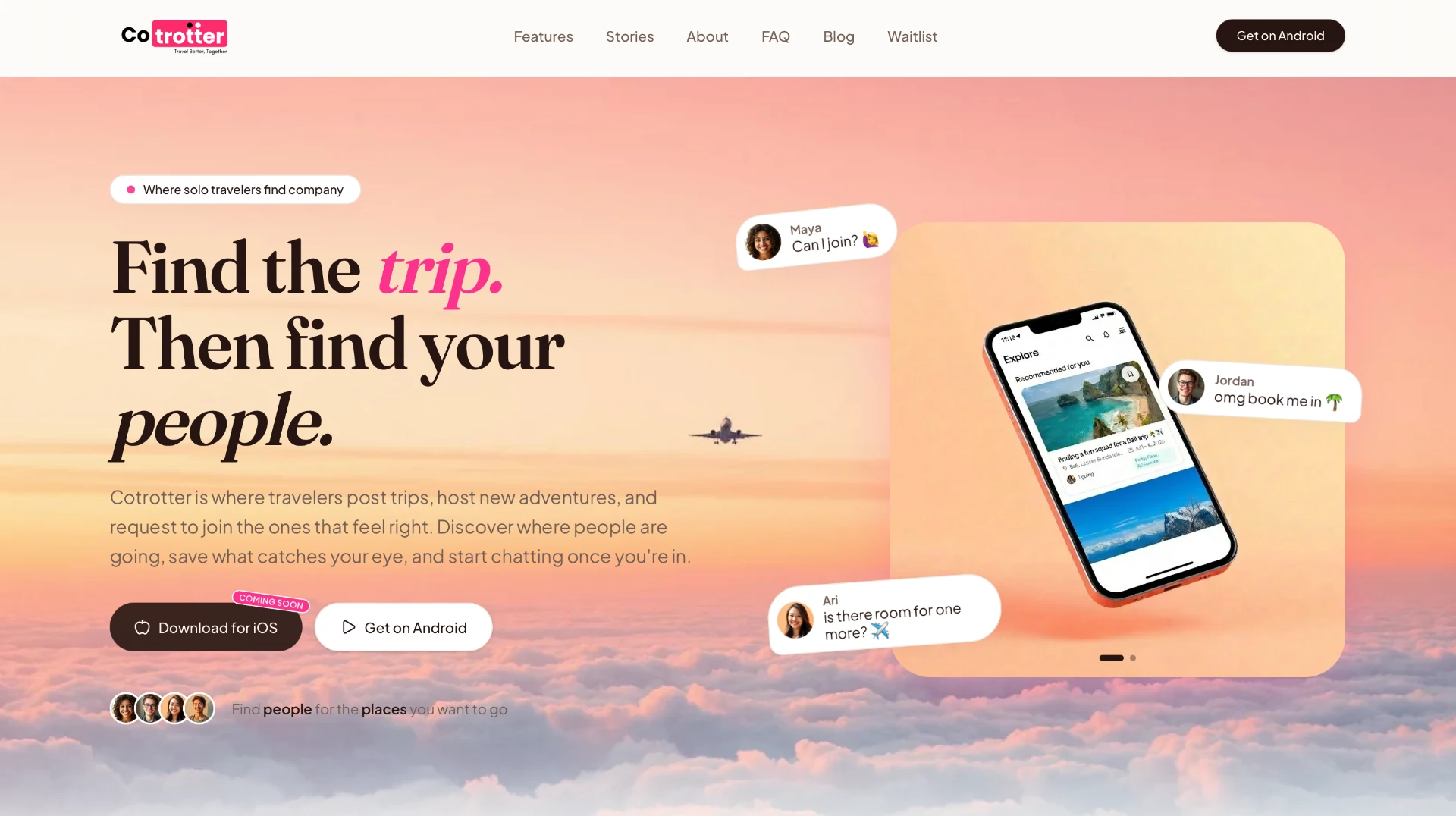
Where solo travelers find company — post trips, host new adventures, and request to join the ones that feel right.
- Industry
- Travel & Social
- Platform
- iOS · Android · Web
- Services
- Product strategy, UX/UI design, Brand identity, Product development
- Role
- Product strategy, UX/UI design, branding, product development
Project overview
Cotrotter is the studio's flagship product—a social travel platform where solo travelers find company. People post trips, host new adventures, and request to join the ones that feel right. Discover where others are going, save what catches your eye, and start chatting once you're in.
Context
Cotrotter started after one too many dream trips died in a group chat. The world is full of people who want to go to the same places, on the same dates, with the same energy — they just can't find each other. Booking had become easy; finding the right people to go with had not.
Problem
Joining a trip with new people should feel exciting, not risky. The product had to give travelers enough context to choose well — clear vibe tags, real profiles, and hosts who personally approve every join request — without turning into another noisy social feed.
Role and responsibilities
Product strategy, information architecture, UX/UI design, brand identity, and hands-on collaboration with engineering through development.
Research or discovery
Conversations with travelers across archetypes — solo backpackers, small friend groups, hosts running roadtrips — surfaced a recurring friction: too much coordination, too little shared context, and no soft way to meet strangers who wanted the same trip.
User flows and structure
Three primary jobs shaped the app's spine: Post — share your travel plans; Connect — find your people; and Travel — start the adventure. Every screen folds into one of these three moments.
Design exploration
Early explorations tested how much of a trip could stay ambient versus explicit — maps versus lists, cards versus threads, vibe tags versus long descriptions. The final direction favoured warm, editorial surfaces and a soft, human tone over social-app density.
Final solution
A calm, opinionated home for a trip. Travelers browse trips tagged by pace, budget and energy, request to join the ones that fit, and land in a group chat once the host approves. Hosts post the trip they want to take, read every request, and choose who joins — so the group that meets at the airport actually feels right.
Key screens
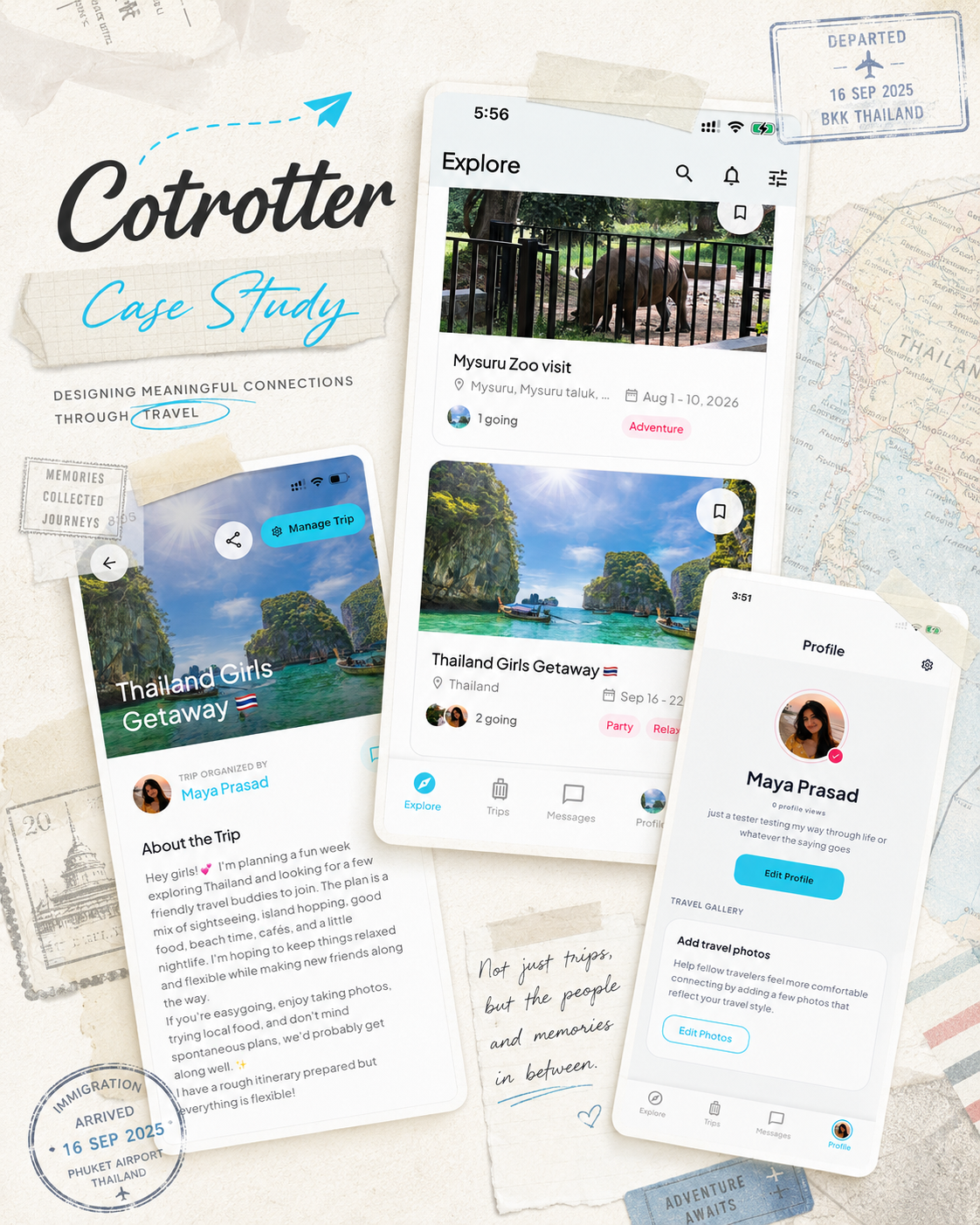
The Explore feed surfaces recommended trips with vibe, dates and destination at a glance. The trip detail brings together the host, itinerary and join request in one scrollable canvas. Profiles keep travelers real — a short bio, a few photos, and the trips they've taken or want to take. Enough to get a genuine first impression before you ever say hi.
Challenges and decisions
Balancing safety and openness in a companion-matching product shaped many of the smaller decisions — no anonymous accounts, host-approved join requests, and a group chat that only opens once the host says yes. Enough friction to feel safe; little enough to keep the excitement intact.
Outcome
Cotrotter is live on Android with an iOS release on the way, and a growing waitlist of travelers signing up for early access at cotrotter.com.
What I learned
Building a product end-to-end—strategy, design and implementation collaboration—reinforced how much clarity in structure earns you at every later step.
More projects
All work →Product Design
Advantage Club
Websites
MattLook
Websites
Swiss Tours
Let's begin
Have a product, website or idea that needs clarity?
Tell me what you are working on, where you are stuck and what you would like to create.